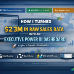
How I Turned $2.3M in Raw Sales Data into an Executive Power BI Dashboard
If you’re a business owner, a learner, or an executive, here’s something I know for sure: data is powerful only when it tells a clear story. Spreadsheets alone won’t give you the insights you need. That’s why I decided to build an interactive Power BI dashboard that turns raw sales data into decision-ready insights, highlighting growth, profitability, and risks — all at a glance.
Today, I want to walk you through the process, so you can see how data can transform your business and how you can confidently create dashboards that actually drive decisions.
Key Insights I Discovered
Working with $2.3M in sales data, I was able to reveal:
46.88% YoY growth — showing which periods were your winners (and which were lagging)
Top-performing regions & segments — where you should focus your resources
Profit leakage & discount risks — spotting areas to protect your margins
Top product category — Technology emerged as the most profitable
These insights aren’t just numbers; they’re the story your business needs to make faster, smarter decisions.
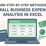
Step 1: Data Cleaning & Preparation
The first lesson I share with anyone learning analytics: clean data is everything. Without it, your dashboard can mislead instead of guide.
Here’s what I did:
Removed duplicates and fixed inconsistent category names
Standardized date formats and validated timelines
Handled missing values in sales, discount, and profit fields
Tip for learners & business owners: Always start with a clean, reliable dataset — it’s the foundation of any great dashboard.
Step 2: Data Modeling
Next, I structured the data for accuracy, speed, and actionable insights:
Built a star schema — one fact table for sales, dimension tables for products, regions, and dates
Created a dedicated Date Table for precise YoY and trend analysis
Set clean relationships between tables to ensure consistent reporting
Business owners, this is critical: if your data isn’t well-structured, even the best dashboard won’t tell the real story.
Step 3: Advanced Analysis with DAX
Here’s where dashboards become intelligent:
Used SAMEPERIODLASTYEAR to calculate YoY growth
Created slicer-safe growth indicators (▲ ▼) for executives to see trends at a glance
Built calculated columns to validate profit margins
If you’re learning Power BI, mastering DAX is a game-changer. It turns static data into actionable insights.
Step 4: Dashboard Design & Interactivity
I focused on executive-friendly design:
Added slicers for region, category, and segment
Used clear visual cues — colors, icons, and combo charts
Made KPIs instantly readable for fast decision-making
Learners: remember, it’s not just about creating charts — it’s about telling a story your audience can trust and act on.
Step 5: Business Impact
The results? Executives can now:
Track growth, profitability, and risk instantly
Spot profit leakage and discounting issues
Make data-driven product and regional decisions
Communicate insights visually and confidently to stakeholders
Business owners: imagine being able to make these decisions without guessing, backed entirely by your data.
Tools & Skills I Used
Power BI — interactive dashboards
DAX — advanced measures for growth and KPIs
Data Cleaning & Modeling — reliable and scalable datasets
Business Analytics & Storytelling — translating numbers into decisions
Explore & Learn
GitHub (Full Project & PBIX): Sales Dashboard Project
If you want me to help you analyze your own business data, design dashboards, or mentor your team, don’t hesitate to contact me. Together, we can unlock insights that drive real growth and profitability.
Key Takeaways
Clean, structured data is essential — your dashboard depends on it.
Advanced DAX measures make insights actionable — learn formulas for YoY growth, margins, and KPIs.
Design dashboards for clarity — executives need insights they can understand instantly.
Visual storytelling is key — data becomes powerful when it’s easy to interpret.
Remember: Data isn’t just numbers — it’s a story that drives action. Build dashboards, share insights, and let your business decisions be guided by facts, not guesses.